 Loyal Receptionist
Website widget
The website widget is the chat bubble visitors see in the corner of your site. It runs the same agent as your phone line — same prompt, same knowledge, same booking rules — so a visitor can talk or type, get a price, and end up on your calendar without ever leaving the page they were reading.
Live at /settings/widget in the sidebar.
What you pick — and what it gives the visitor
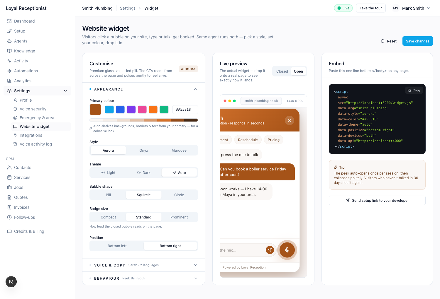
Three small choices on the left turn into a fully-formed widget on the right, plus a one-line script you paste into your site. The whole page is laid out so you never have to scroll between deciding and previewing:
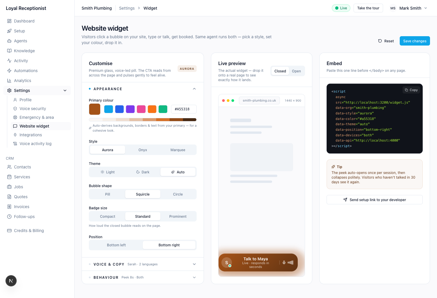 Left: the four stages behind a tab strip. Middle: the live preview against a fake browser. Right: the embed snippet your developer pastes.
| Column | What it is |
|---|---|
| Customise | Four stages stacked behind a tab strip — Trigger (what visitors see first), Surface (what opens), Input (typing / voice / both, plus the voice toggles and price chips), More (languages, auto-open, devices, page limits, calendar pair). One stage visible at a time so the column stays short. |
| Live preview | The real widget, running in an isolated frame. The Closed / Open toggle flips between the bubble visitors first see and the panel they land on after clicking. Edits update the preview ~150ms after each change — no save needed to see them. |
| Embed | The single <script> tag to paste before </body> on any page of your site. Includes a Copy button and a "send setup link to your developer" button if it's not you doing the paste. |
The four stages — visitor's mental model
Before you touch a knob, the model: a visitor moves through three things in order — what they see (trigger), what opens (surface), and how they reply (input). Each stage is independent, but with a few automatic rules so impossible combinations can't ship:
| Picking… | Forces… | Why |
|---|---|---|
| Surface = Voice | Input = Voice only | Voice surface has no text input — typing has nowhere to go. |
| Trigger = Input field | Trigger placement = Inline | The search-bar trigger is meant to sit inline on your hero / contact page, not float in a corner. |
You can't fight the rule — change the upstream pick and the downstream control unlocks.
Stage ① — Trigger: what visitors see first
Three triggers, all open the same panel. Pick the one that fits the page they're landing on:
| Trigger style | Looks like | When to pick |
|---|---|---|
| Icon bubble (default) | A floating pill / squircle / circle in the corner. Three motion styles below — Aurora, Onyx, Marquee. | Most sites. The corner is where visitors already look. |
| Input field | A pill-shaped search-bar on your page: [Ask Maya... 🎙 ▷]. Sits inline, not floating. | Hero sections, contact pages, anywhere a "type a question" affordance is more natural than a floating bubble. |
| None | No trigger on the page at all. Your own button / link opens the widget via window.vox.open(). | Custom integrations — e.g. an existing "Help" button you already own. Pair with vox.close() to close it programmatically. |
When the trigger is an icon bubble, three sub-knobs appear (shape, badge size, motion). They're hidden for the other trigger styles because they don't apply.
Motion styles (icon trigger only)
| Style | Vibe | When to pick |
|---|---|---|
| Aurora | Voice-led pill: avatar, label, animated mic waveform. Gradient fill, soft halo. | Default. Reads as friendly and modern. Works on almost any brand. |
| Onyx | Editorial concierge disc: gold-ring avatar, dark accent. | High-end services — solicitors, architects, private-tier trades. |
| Marquee | Compound pill: mic disc on the left, chat icon on the right, bold primary fill. | Maximum loudness. Pick when the site is busy and you need the bubble to win attention. |
Stage ② — Surface: what opens
What the visitor sees after they engage the trigger:
| Surface style | What it is | Status |
|---|---|---|
| Chat | The thread-style panel — text + voice, suggested chips, live transcript. | Live |
| Voice | 100% voice, no typing — animated EQ bars while the agent talks, live transcript below, plus an End call button and a "Prefer to type?" link that flips the visitor back to the chat panel mid-session. | Live |
| Compact | One-line input + mic, no thread view. For mobile / narrow embeds. | Coming — falls back to Chat for now |
Surface placement: dock-right and dock-left ship today; inline and modal save correctly but fall back to dock (with a console warning) until rendering catches up.
Stage ③ — Input: typing, voice, or both
How the visitor replies. The choice flows through everywhere — the trigger's input-field bubble hides the 🎙 when typing-only, the chat panel hides the text input when voice-only:
| Modality | What it is |
|---|---|
| Voice only | No text input. Visitor talks; transcript shows live. |
| Both (default) | Type or tap the mic — visitor picks per turn. |
| Typing only | No mic prompt anywhere. Pure chat. |
The Input stage also carries the voice-adjacent toggles:
| Control | What it does |
|---|---|
| Show tap-and-talk intro | Visitor sees the orb + cue before the call starts. Off = the panel opens straight into a live call. |
| Ring tone on connect | A soft tone when the panel opens. Off by default in dark sites. |
| Ask mic permission up-front | Smoother first-time voice — the OS prompts as soon as the panel opens. If off, we lazy-grant on first mic press. |
| Show price chips when quoting | When the AI quotes a price ("That's £80"), it surfaces as a coloured chip in the chat. Nice for "did I read that right?" moments. |
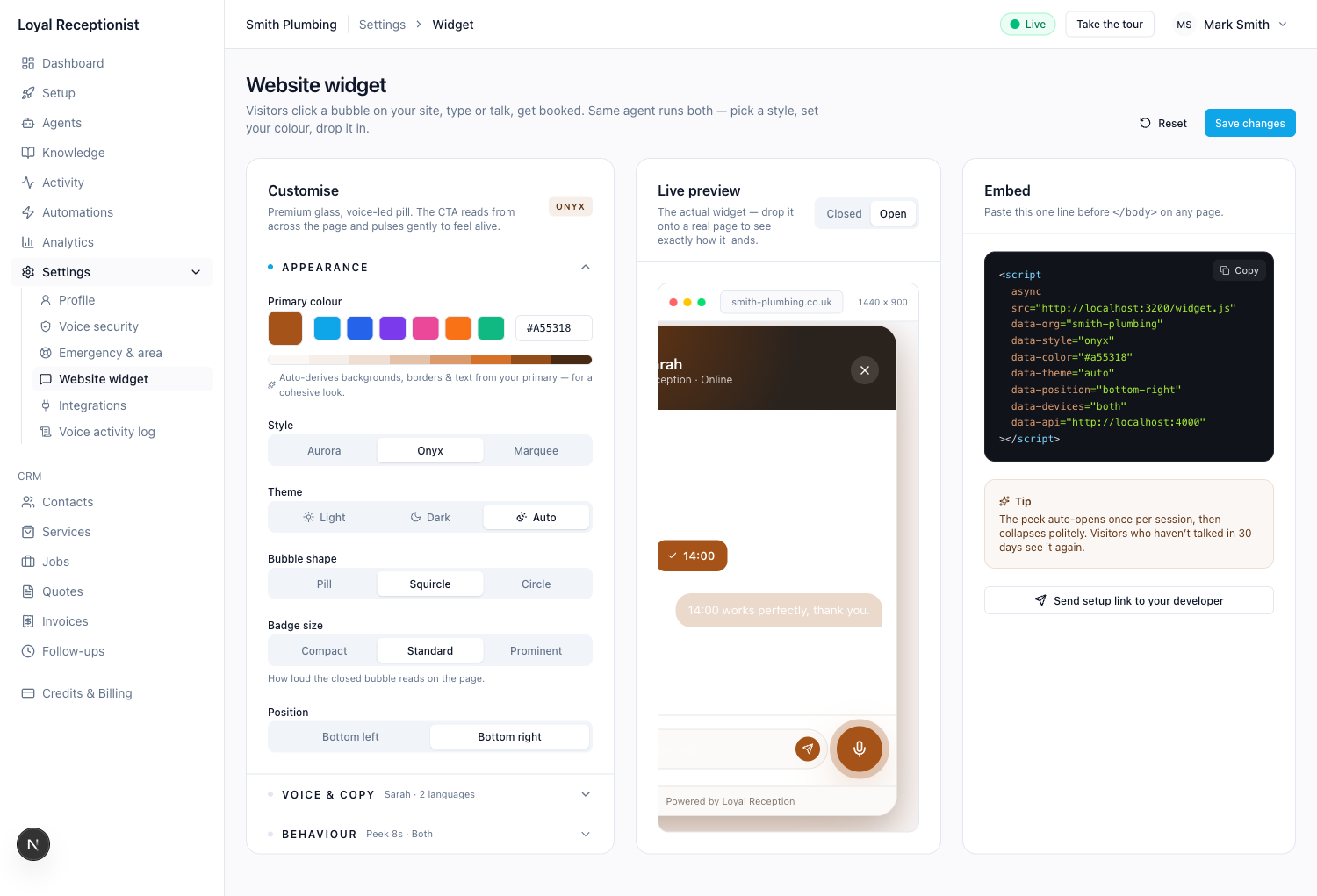 Onyx, open. Dark editorial header, gold-ring avatar, suggested time slots inline.
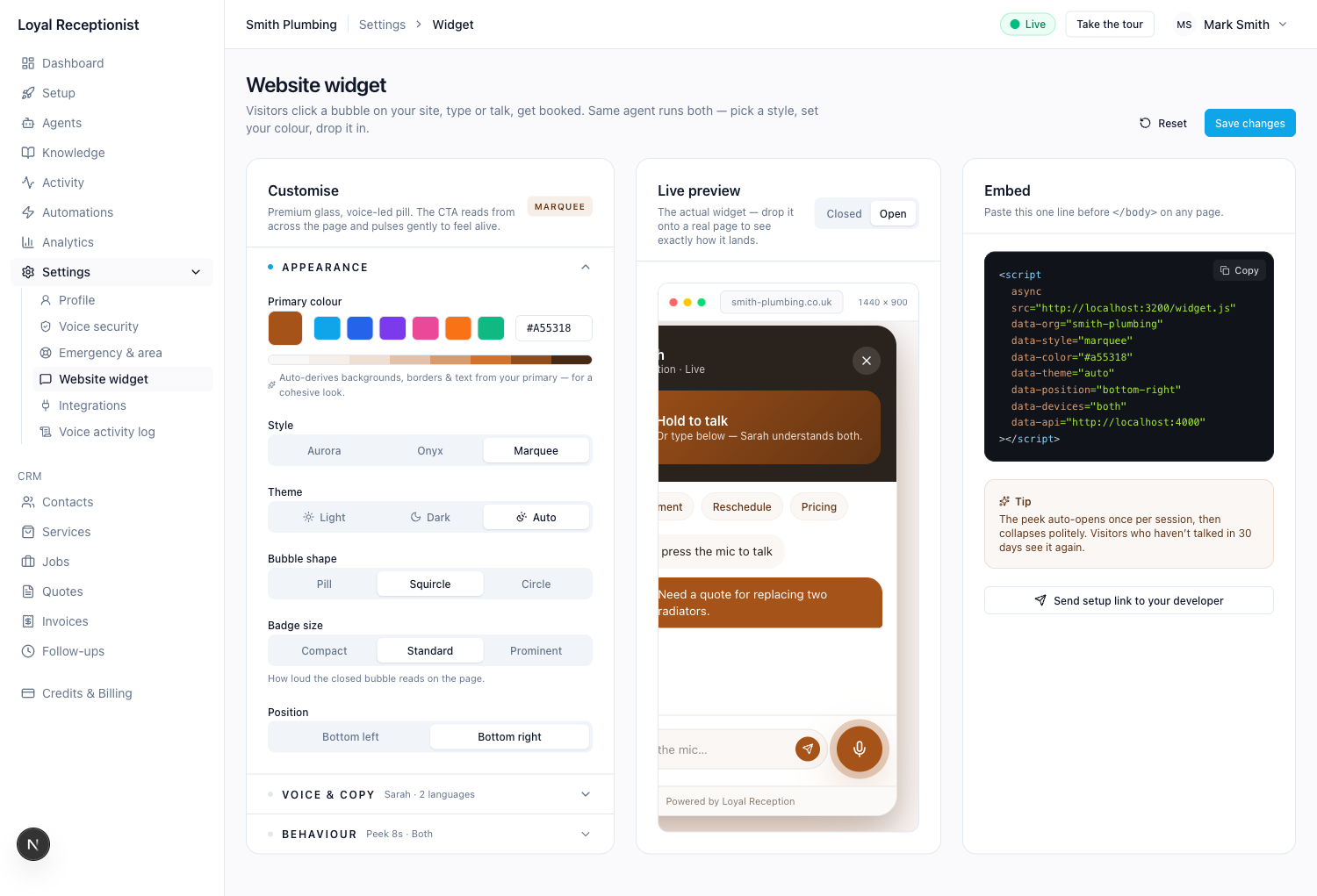 Marquee, open. Dark header with a hero 'Hold to talk' panel mounted right inside it.
Primary colour drives everything
You pick one hex value. From it we derive a 10-stop tint scale, plus tinted borders, hover states, chat-bubble backgrounds, even the syntax-highlighting in the embed snippet on the right.
You'll see the derived palette as a strip directly under the swatches — that's what the visitor's eye actually sees once the widget renders. If a colour reads ugly there, try a different stop; you almost never need to fiddle with anything else.
Tip: the picker accepts a hex typed straight into the right-hand input (#A55318), the six preset swatches, or the native OS colour picker on the left. All three update the preview live.
Widget copy follows the routed agent
The agent's name, the welcome line, and the CTA label on the closed pill aren't set on the widget page — they're derived from the routed agent on each session. That's what makes per-agent routing work without duplicate settings: a page mounted with data-agent="dave" gets a "Talk to Dave" pill and Dave's opener, while your default mount stays on your default agent.
- To rename the agent or change how they open, edit the agent at
/agents. - To change the business name shown in the widget header, edit Settings → Profile.
The one copy control that lives on the widget page is Languages (in the More stage): tick the languages the agent answers in — English plus Cymraeg by default for our Welsh customers. Add Español or Français with a click; the agent picks the language to reply in based on what the visitor typed.
More — the behaviour toggles
The small settings that decide when and where the widget shows:
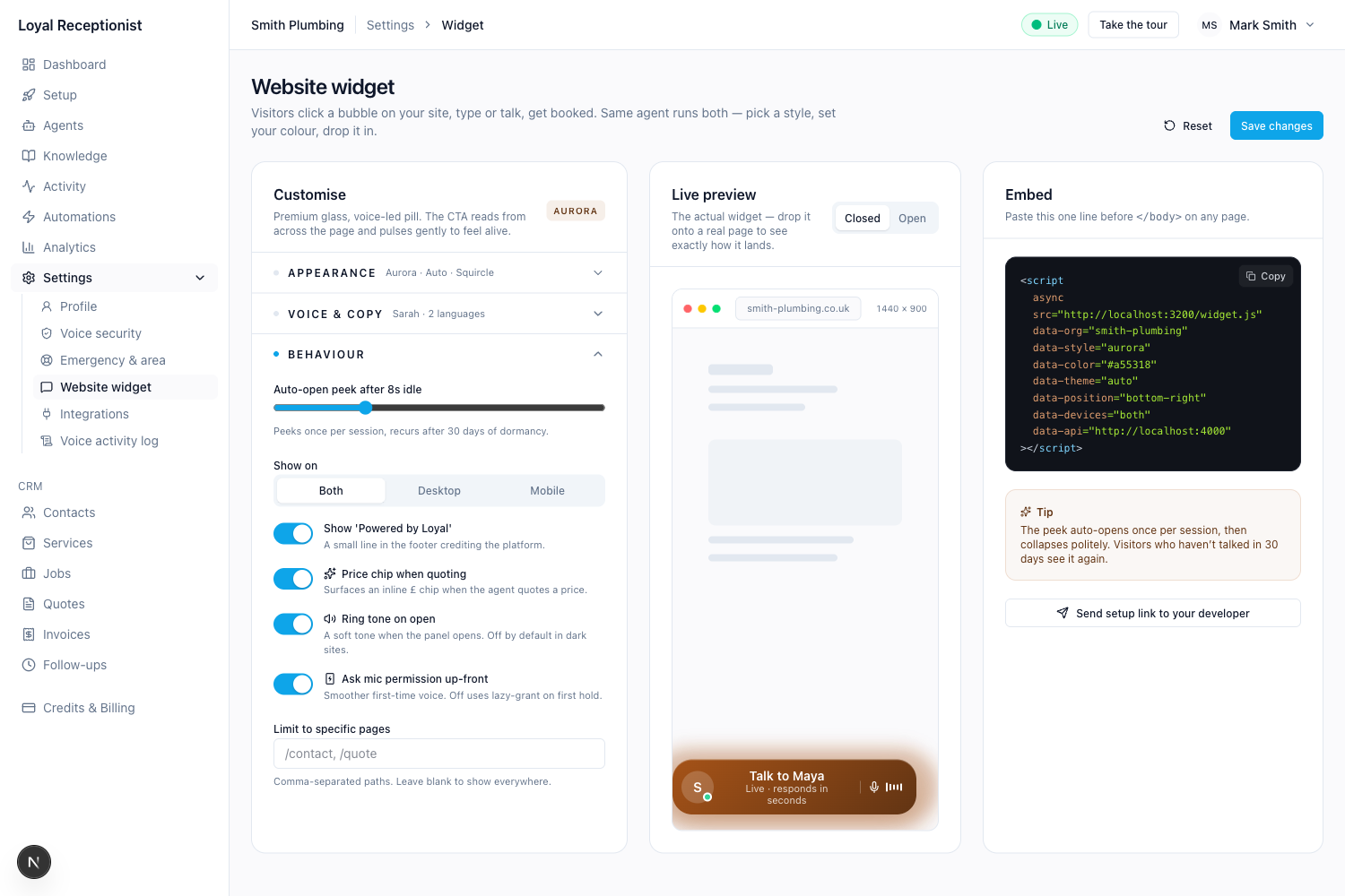 More: languages, auto-open slider, devices, page allow-list, branding, calendar pair.
| Control | What it does |
|---|---|
| Auto-open peek | The widget can pop a small "Available now" teaser after N seconds of idle. 0 = never. The teaser shows once per session, then suppresses for 30 days after the visitor dismisses it. |
| Show on | Both / Desktop / Mobile. Gated by viewport width at runtime — visitors on the wrong device class never see the widget. |
| Limit to specific pages | Comma-separated paths (e.g. /contact, /quote). Blank means show everywhere. |
| Show "Powered by Loyal" | Small line in the footer of the chat panel. On by default. |
| Pair a booking calendar | Mounts a slot-picking calendar alongside the chat so visitors can book visually. |
The Open state — what the visitor actually uses
Click the Open toggle in the live preview to see the panel itself:
 Aurora open: gradient header, three suggested chips, agent and visitor messages, mic + send below.
Three things to notice:
- Suggested chips under the header — Book appointment, Reschedule, Pricing. These are one-tap shortcuts. Tapping a chip injects it as a visitor message; the AI replies the same way it would to a typed question.
- Big mic button to the right of the text input. Tap to talk — same agent as your phone line, same voice. The transcript appears live as you talk.
- Inline price chips appear next to agent messages whenever the AI quotes a number (toggle in the Input stage).
Embedding it on your site
The right column shows the exact <script> tag to paste. One line, paste before </body>, you're live:
<script
  async
  src="https://app.loyalreception.co.uk/widget.js"
  data-org="smith-plumbing"
  data-style="aurora"
  data-color="#A55318"
  data-theme="auto"
  data-position="bottom-right"
  data-devices="both"
></script>
The snippet only includes attributes you've actually changed from the default. So a tenant on Icon / Chat / Both gets the seven-line snippet above. A tenant on Input field trigger with Voice only input adds two lines:
<script
  async
  src="https://app.loyalreception.co.uk/widget.js"
  data-org="smith-plumbing"
  data-style="aurora"
  data-color="#A55318"
  data-theme="auto"
  data-position="bottom-right"
  data-devices="both"
  data-trigger-style="input-field"
  data-input-mode="voice"
></script>
Other picks emit their own attributes the same way — data-trigger-placement, data-surface-placement, data-display (sans/serif), data-show-voice-intro="false", and the calendar-pair attributes all appear in the snippet only when they diverge from the default.
Routing the widget to a specific agent (multi-agent orgs only). If you've added a second agent — for sales, install, recruitment, complaints — add data-agent="<slug>" to mount the widget against that agent on a given page. The page without the attribute falls back to your default agent.
<script
  async
  src="https://app.loyalreception.co.uk/widget.js"
  data-org="cardiff-web-co"
  data-agent="dave"
></script>
That snippet on /install or your sales landing page makes Dave (install consultant) answer there, while every other page on your site stays on Sarah (your default). You can copy the pre-filled snippet for any agent at /agents/[id] → Routing & channels.
Routing the widget to a specific playbook (data-intent). When you want the same Sarah to handle a page differently — different opener, different rules, different escalation — add data-intent="<slug>". Create the playbook first at /intents, then mount the widget with its slug:
<!-- Buyer enquiry on the listings page -->
<script
  async
  src="https://app.loyalreception.co.uk/widget.js"
  data-org="cardiff-properties"
  data-intent="buyer-enquiry"
></script>
data-agent and data-intent are independent — set either, both, or neither. When both are set, the channel's agent pins the persona (voice, name) and the channel's playbook pins the situation (opener, rules, escalation). A page without either falls back to your default agent and its default behaviour. The full model is in Playbooks.
Programmatic open / close (for trigger-style="none" setups, or any time you want to launch the panel from your own button):
window.vox.open();   // open the chat panel
window.vox.close();  // close it
Both are no-ops if the widget hasn't booted yet (no errors thrown).
The Copy button next to the snippet gets it onto your clipboard in one click. If you'd rather hand it off, Send setup link to your developer at the bottom of the column emails the snippet plus a one-pager on where to paste it.
Worth knowing:
data-*attributes override the saved settings — useful for testing a darker theme on one page without touching anything in your dashboard. The routing attributes (data-agent,data-intent) are independent and combinable: leave both out for default behaviour, setdata-agentfor a different persona, setdata-intentfor a different situation, set both to pin both.- The widget runs inside a shadow DOM so it can't bleed CSS into your site, and your site can't bleed CSS into it.
- The script is async and only ~28KB gzipped. It does not block your page from rendering.
- Voice is loaded on-demand when a visitor taps the mic, so the bundle is small for visitors who only type.
What happens after a booking — and after the session ends
The widget is designed so a visitor never has to wonder "did that just work?" Two moments do most of the heavy lifting:
The green confirmation
The instant a booking is confirmed mid-chat, Sarah's last reply is followed by a green check banner: "Booked! 2026-05-22 at 09:00." — and the chat panel automatically closes 5 seconds later. The visitor doesn't have to click anything. The same banner shows for cancellations and reschedules.
The "Start new chat" state
After the panel closes, the bubble in the corner switches to a quieter "closed" look with a small summary card: "Last session ended — boiler service booked. Start new chat?" Tapping it opens a fresh session — Sarah greets them again with no carry-over context. The old transcript is preserved in your Activity feed.
This pattern is deliberate: most domestic-trade visitors want one thing, get it, and leave. Forcing them to keep a stale chat open after a booking is friction. Letting them re-open with one tap if something else comes up is the right balance.
The 5-minute idle close
If a visitor opens the panel but goes idle (no typing, no voice) for 5 minutes, the session ends on its own and Sarah's summariser runs against whatever transcript exists. The bubble shows the same "Start new chat" state. This is what stops half-finished conversations clogging your Activity feed as "still active".
Pricing and callback requests inside chat
Sarah uses two tools heavily during chat that are worth knowing about:
get_price_estimate— fires the moment a visitor asks "how much?". It word-matches against your Services and quotes the cheapest match. If nothing matches, Sarah falls back to "the engineer will quote when he arrives" — which is your signal to either add a service or extend a description.request_callback— fires when a visitor needs something Sarah can't book directly (out-of-area, after-hours, complex job). It captures their name + phone + best time and lands as a row in your Activity feed taggedcallback-requested. You should ring them back the same day.
Both are inside the same conversation state machine that protects against ghost bookings — see Pricing & quotes for the full mechanics.
Try it before you ship it
The Closed / Open toggle in the live preview flips between the closed bubble and the open panel without leaving the page, so you can compare both states against your brand at a glance. If you change the primary colour, both update instantly — there's no save button on the preview.
When you're happy: Save changes in the top right of the page. Refresh any site you've already pasted the snippet into and you'll see the new look on the next visit.
Common gotchas
- The bubble doesn't show on mobile. Check Show on — it might be set to Desktop.
- The peek never appears. It only shows once per session, and once a visitor dismisses it, it's suppressed for 30 days. Open an incognito window to retest.
- The colour looks weird in the chat panel. Try a neighbouring tint — the picker's derived palette strip shows the eight stops we use; if step 50 (the lightest) looks dirty, your hex is too saturated.
- The widget shows on a page where it shouldn't. Use Limit to specific pages with a comma-separated allow-list, or unpublish the agent until you've tightened it.
What it doesn't do (yet)
- The widget can answer a visitor's voice question, but it can't currently take a card payment inline — they're routed to a Stripe link if you have payments enabled.
- No mid-call transfer to a human team member. The visitor gets the agent's promise to ring you back inside business hours, plus an SMS confirmation with their callback number. (Mid-call transfer to a different playbook — same Sarah, new situation — does exist: see Playbooks.)
- Calendar sync — bookings made in chat land in your dashboard immediately, but two-way sync to Google or Microsoft calendars is on the roadmap.
- Compact surface is in the controller but not rendered yet — the widget falls back to the standard Chat surface. Same for inline placement of the trigger / surface (anchoring into a host-page
<div data-vox-trigger>/<div data-vox-surface>) and modal placement — the settings save correctly, the widget console-warns and falls back to dock; the rendering will catch up in a future release.